Feature Engineering
A major bottleneck in production ML is training-serving skew—the discrepancy between how features are calculated during model training versus how they are queried at inference time. To solve this, we use Feast as our Feature Store.
Key Feast Concepts in this Project
- Entity: The primary key. Here, the
pickup_location_idrepresents a taxi zone. - Data Source: The source of truth for features. We define a batch file source pointing to our offline parquet file:
data/processed/hourly_demand_features.parquet. - Feature View: Maps features to entities and defines metadata (schema, TTL, and data source).
Offline & Online Stores
Feast handles two databases under the hood:
- Offline Store (DuckDB): Optimized for analytical queries. Used during training to perform point-in-time joins and retrieve historical feature records.
- Online Store (SQLite): Optimized for fast, low-latency lookups. Materialized features are loaded here for real-time predictions.
import ipywidgets as widgets
import matplotlib.pyplot as plt
import pandas as pd

# Load feature data from the processed parquet destination
features_path = "../data/processed/hourly_demand_features.parquet"
df = pd.read_parquet(features_path)
df["event_timestamp"] = pd.to_datetime(df["event_timestamp"])
print(f"Loaded {len(df)} feature rows. Columns:")
df.head()
Stream
Loaded 71253 feature rows. Columns:
| pickup_location_id | event_timestamp | pickup_count | hour | day_of_week | is_weekend | month | |
|---|---|---|---|---|---|---|---|
| 0 | 1 | 2022-10-24 17:00:00 | 1 | 17 | 0 | False | 10 |
| 1 | 1 | 2022-10-25 03:00:00 | 1 | 3 | 1 | False | 10 |
| 2 | 1 | 2023-01-01 05:00:00 | 1 | 5 | 6 | True | 1 |
| 3 | 1 | 2023-01-01 08:00:00 | 1 | 8 | 6 | True | 1 |
| 4 | 1 | 2023-01-01 11:00:00 | 1 | 11 | 6 | True | 1 |
Visualize Taxi Pickups Over Time
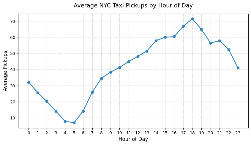
Let's look at the average demand curve across hours of the day.
hourly_avg = df.groupby("hour")["pickup_count"].mean()

plt.figure(figsize=(10, 5))
plt.plot(
    hourly_avg.index,
    hourly_avg.values,
    marker="o",
    color="#3182bd",
    linewidth=2,
)
plt.title("Average NYC Taxi Pickups by Hour of Day", fontsize=14, pad=15)
plt.xlabel("Hour of Day", fontsize=12)
plt.ylabel("Average Pickups", fontsize=12)
plt.grid(True, linestyle="--", alpha=0.6)
plt.xticks(range(24))
plt.show()
Interactive Zone Explorer
Use this interactive widget to inspect features for a specific pickup zone location ID.
unique_zones = sorted(df["pickup_location_id"].unique())
zone_select = widgets.Dropdown(
    options=[str(z) for z in unique_zones[:30]],
    value=str(unique_zones[0]),
    description="Location ID:",
    disabled=False,
)


def plot_zone_demand(zone_id):
    zone_df = df[df["pickup_location_id"] == zone_id].sort_values(
        "event_timestamp"
    )
    if zone_df.empty:
        print("No records found for this location.")
        return

    # Plot pickups for the first week of the month
    sample_df = zone_df.head(168)  # 24 * 7
    plt.figure(figsize=(12, 4))
    plt.plot(
        sample_df["event_timestamp"],
        sample_df["pickup_count"],
        color="#e6550d",
        label=f"Zone {zone_id}",
    )
    plt.title(
        f"Hourly Taxi Pickups for Location ID {zone_id} (First 7 Days)",
        fontsize=13,
    )
    plt.xlabel("Timestamp", fontsize=11)
    plt.ylabel("Pickups", fontsize=11)
    plt.legend()
    plt.grid(True, alpha=0.3)
    plt.show()


# Precompute all outputs for the 30 zones client-side
plot_outputs = []
for zone_id in unique_zones[:30]:
    out = widgets.Output()
    with out:
        plot_zone_demand(zone_id)
    plot_outputs.append(out)

stack = widgets.Stack(children=plot_outputs, selected_index=0)
widgets.jslink((zone_select, "index"), (stack, "selected_index"))

widgets.VBox([zone_select, stack])